Wednesday, November 16, 2011

Mulnotanoa Bridge Oregan

24"x18"
I painted in a waterfall. The waterfall is light blue in middle, dark blue next to the light blue is blended together. I repainted the left side of the falls. I put more dark blue where the purple used to be. The purple is closer to the edge, but blended into the dark blue. I painted the right side dark green with purple stripes. I repainted darker blue in the V shape of the falls and blended it into the purple. I repainted the falls under the bridge almost white blue color. I painted green and purple in the bridge's arches. The hardest part was painting in between tree branches and painting in the arch. I painted in dark green lines and jagged circles on the left hill. I painted the branches red on the right and orange on the left side. The red is bright with the dark green and the orange against the blue because they are complementary colors. I painted a dark purple line at the bottom of the falls and a light purple line at the top of the falls, but below the bridge. I painted a dark green line on the edge of the big hill on the left side to give it interest. I repainted the orange and red branches to cover up white spots and make it stand out. I painted the bridge a lime green. I painted more dark lines and spots on the big hill on the left side. I painted the sides. I painted the bottom of the sides. I painted white over the bridge and connected them to the red branches, then paint them red. This painting took five sessions to complete. This painting is outstanding, loud, action, nature, and calm. I used a stretch canvas, acrylic paint, brushes, and water. This painting was finished on September 18, 2011.

SOLD

Two moons Two rhinos

I sketched two rhinos from a photo. The rhino on the left is blue and the one on the right is red. On both rhinos the shading goes from dark at top to light at the bottom. On both the red and blue rhinos I blended the colors together. The background on the left is: light orange at the top, orange in the middle, and red orange at the bottom. The same is for the green background on the right. I repainted the red rhino again. I repainted the blue rhino too. I blend in dark red, red, light red, and lighter red on the red rhino. I also did the same thing with the blue rhino. I shaded both the rhino's legs from darkest to lightest sideways. I painted different shades in the rhino's faces. The blue rhino's horn is orange. Blue and orange contrast because they're opposite of the color wheel. The horns shades are: red orange, orange, and white orange. The eye is orange. The red rhino's horn is green. The horn shades are: dark green, green, and yellow green. Red and green are complementary colors. The eye is green. The background is green on the right and orange on the left. Under the blue rhino's feet is dark red shadows. Under the red rhino's feet is dark green shadows. On the top left hand corner is a light blue full moon with stars the same color. On the top green background there is a pale pink moon with star exactly the same color. I like this painting because two rhinos, two different backgrounds, and two moons. This painting is very unique, colorful, and peaceful. This painting took 3 sessions to finish. I used acrylic paint, brushes, and water. I finished this painting on August 14, 2011

NFS

Indian Animals

20"x10"
 I sketched in the animals fighting with theirs antlers. The top half of the background has orange and red in different places. The bottom half of the background has orange and light orange in different places, too. The animal on the left is green. The animal on the right is purple. On the green animal I painted the top dark green. I blended dark green into the green. The green is in the middle section. Towards the bottom his body is light green. The animal on the right is purple. On the top of the animal is dark purple. I blended the dark purple into the purple. Then I blended in purple with the light purple towards the bottom. I painted the mane green on the purple animal's back. I painted 5 spots down the purple animal's neck yellow, light yellow at top and dark yellow at bottom. I painted both the animal's antlers a light baby blue. Both of the animal's hooves are the same colors as the antlers. I painted red stripes on the green animal's legs. The green animal's mane is purple. I repainted the purple animal's mane green to make it brighter. Green is very hard to paint with because it is very hard to cover up. In the thigh of the purple animal, there is an oval with: yellow, blue, and light pink. The green animal's rump is light baby blue with light pink spots inside of it. I repainted the red stripes on the green animal's legs. The light baby blue glows with the dark orange background because they're opposite of the color wheel. The animals are fighting with their antlers. This painting took 3 sessions to complete. I completed this painting on July 31, 2011. This painting stands out, a lot of action, and very interesting patterns on the animals.

SOLD

Orange Tulips

10"x20"
The first thing I did is sketched in the tulips. I painted the top half of the background a sky blue. The bottom half is red. And in between I blended red and blue together to make a dark purple. I repainted the background to make it brighter. The middle of the background is a light purple. The right side of the tulips is where the sun is hitting it. The left side is shadows. The flower at the top has red orange at the bottom towards the stem for the darkest shadows. The medium color on the flower is orange. The lightest color on the leaves is yellow orange for highlights. Those colors are on the top flower and the flower below it. For the tulips leaves, the darkest shadows is green with a little bit of black in it. For medium shadows the color is green. The highlights are yellow green. I blended in the darkest shadows with the medium shadows. The medium shadows were blended in with the highlights. This painting is bright, calm, and romantic. The orange and blue at the top contrast because they are complementary colors. The red and green contrast because they are complementary colors, too. This painting was completed on July 10, 2011. This painting took 3 or 4 sessions.

SOLD

Ghost Town

20"x16"
First I drew the buildings. I drew a lots of boards that were showing on the old buildings. I drew in the sage brush. I painted the sky blue with purple blended in it. I painted the sky through the boards on some buildings. Then I painted the soil dark purple for shades, and dark green for lighter areas and in some areas are in between purple and green. Next, I painted the grass and bushes lime green. I painted some boards mustard yellow. I painted more boards on the buildings. The boards with light shining on it, it is mustard yellow with white in it. The boards that are in between light and dark, it is mustard yellow with orange in it. The super dark boards are mustard yellow, orange with purple in it. I still was working on the boards of the buildings.The beams that were the lightest was light mustard color. The second lightest are plain mustard yellow. The dark boards are mustard yellow with orange and then I blended dark purple. I painted more boards from the last time I painted. I painted the tin building on the left side light gray, gray, and dark gray and blend it in with some orange. I painted the barrel light yellow, mustard yellow with a little bit of orange in it. The darkest part of the barrel is orange. The holes in the barrel and very top of the barrel is dark purple. This painting reminds me of Halloween because of the dark purple against the bright lime green. The buildings glow against the dark sky. This painting is interesting, loud, and Halloween looking. This painting took 6 sessions to complete. I used acrylic paint, brushes, and water. This painting was finished on July 3, 2011.

NFS

Saturday, November 12, 2011

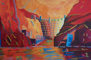
Tie-Dye Hoover Dam

3' x 2'
The first thing I did is sketch in Hoover Dam, the sky, the cliffs, and the Colorado River. I painted the sky mustard yellow, then blend it with orange and red. The right cliff is darker than the left cliff because the sun is not shining on it. The right cliff is dark purple at the bottom. I mixed red and blue and a little bit of black. From halfway up on the right cliff  is dark red orange at the top for highlights. The left cliff is dark red at the top for highlights. Then orange underneath the dark red. Under dark red is purple, then darker purple at the bottom for shades. I blended the purple lines jagged  for shadows and textures. The right side of the river reflects dark purple from the cliff above it. The middle section of the river reflects orange from the dam. The left side of the river reflects red from the cliff above it and some orange blend into it.
From left to right, I painted the dam from dark purple , red purple, red, lighter red, red, red orange, pure orange, yellow orange, yellow, and lighter yellow. I painted dark purple, red purple, and red orange at the base of the powerhouse. I painted the shadow of the water building in the cliff, dark purple, and also the powerhouse the same color. Both of the buildings where it is lighter are red orange. The round building by the dam at the left hand corner is dark purple, red purple, red, and then orange. The lines in the dam are dark green, green, blue, and then light blue. The lines on the round building is the same color as the dam. I painted white lines on both sides of the cliff. I then painted whites squiggly lines in the river for reflection. I painted over the lines on the red purple area of the cliff green yellow. The purple area of the cliff is yellow. The left cliff has green yellow lines at the bottom, blue green and light blue lines at the top. I painted the powerhouses further back dark and the closest is light. In the powerhouses the windows in the dark purple is dark green. In the red purple area of the powerhouse the windows are yellow green. The spillway building holes are the same color as the powerhouse. The purple side is the same as the left side of the dam with yellow green. The square things at the top of the dam is blue and green. I finished painting the towers on the dam. I painted the portals a bright blue and the other one dark blue. I painted the colors above the river reflected in the water squiggly lines for reflection. I painted the buoys in front of the dam a light baby blue. I painted the outer edge of the portal a dark blue. The under side of the buoys barrier is also dark blue for shadow. I painted baby blue highlight on the bottom of the hole of the right portal and also on the water building too. I outlined the top of the water building green and baby blue and also did the same on the dam. The power grid towers were baby blue. I finished this painting on May 22, 2011. This painting took 7 sessions to complete. This painting is loud, calm, and glows like the moon. All the colors of this painting reminds me of a tie-dye shirt. I used a very big canvas, acrylic paint, and painting brushes.

SOLD

Anna Sitting on Hoover Dam

We sketched me sitting on Hoover Dam. We painted the sky blue green. We painted the cliffs red brown. The lighter red is for highlights and the dark red is for shadows where the sun is not shining. The highlights and shadows make it look like a rock. The face of the dam, towers, etc, are pure green. Pure green is hard to paint because it does not cover up well. Parts of the dam are light green for highlights where the sun is hitting it and the dark green is the shadows where the sun is not shining.  The top of the intake tower are blue green. In the foreground the top of dam is dark red for shadow. I painted my face, arms, and legs a pinkish color. The right side of my face, arms, and legs are light pink to show where sun is shining. The left side of my face, arms, legs are dark pink for shadows. I painted my shirt dark blue for shadows and light blue for highlights. The dam took a long time to finish because all of the details. I finished this painting on April 4, 2011. This painting stands out because of the reds and greens contrasting. This is bright and peaceful. I outlined everything with felt marker.

For Sale:  14"x18" SOLD
Canvas Board

Russian Buildings with Weather Front Antlers

I sketched in the Russian buildings and weather front antlers. I painted the background pure orange and then repainted it to make it brighter. I painted the weather front antlers a bright sky blue. Then I repainted the weather front antlers again to make it stand out more against the orange background. Orange and blue contrast because they are comparmery colors. The Russian buildings have different shades of blue. The shades of blue come in pattern. The pattern are pale light blue, sky blue, blue, and very dark blue. The pattern took awhile because all the shapes of the buildings. The tops of the buildings are rounded. The wall is on either side of the buildings. The buildings windows are red at the top, orange in the middle, and yellow orange at the bottom. There is windows in the walls also. The buildings took a long time because all of the details of the shapes and the different shades of blue to paint it. The building and antlers pop out because of the orange and blue colliding with each other. The building is in Mocow, Russia. Mocow is the capital of Russia. This building is one of the most famous buildings in the world.
This painting was completed on March 6,2011. This painting is loud and jumpy. Orange is a warm color and blue is a cool color. This painting reminds me of fire and water colliding.

SOLD

Thursday, November 10, 2011

Ressler Daughter's Shop in the Moonlight

I sketched in the beams of the shop and also the roof. I painted the sky purple at the top, blue, then lighter blue at the bottom. I painted the beams that were in the background pure black. I painted the roof a dark red orange with black in it, then I repainted it pure orange to give the painting balance with the orange moon and stars. I painted the wall on the right red orange and the beams attached to the wall the same color. The wall next to the red wall is yellow orange. The beams in the foreground is the same color. I repainted the sky pure blue sky at the top and then lighter blue towards the bottom. I painted a full moon orange in the center of the sky. First I painted the moon white, then pure orange. I did the same thing for the stars. This painting is loud, romantic, and bright. This painting took 3 sessions. I finished this painting on February 20, 2011.

For Sale: 16"x20" $50
Canvas Board

Monday, October 24, 2011

Sexy Builders at Resslers Shop

I sketched out the Ressler's shop that was under construction that is behind us. You can see it very well through the trees in the forest area. I sketched 3 builders from pictures. I painted the background blue which is the sky. The top is dark blue and the bottom is light blue. The beams in the foreground is black and the beams in the background are gray. I then repainted the sky darker blue at the top and then blended it into the lighter blue at the bottom. That took awhile because I had to paint carefully in between boards. The wall on the left is pure black and the wall next to it is dark gray. I then painted 3 white fluffy clouds in sky then I shaded the bottom of clouds gray-blue. I repainted the clouds orange to contrast with the blue. Orange and blue are opposite of the color wheel. The top of the cloud is light orange and the bottom is dark orange. I painted all the builders' tools and hard hats orange. All the builders shirts are bright yellow and their pants are tan. The faces of the builders on the top of the shop are black. The builder on the ground, his face and arms are white. The shop is all completed. The shop belongs to one of the Ressler's daughter's for storage of cars. I painted all the right side of the beams light gray. I outlined the foreground beams with red felt marker on all the left side of the beams. I outlined the right sides of all beams and top of them with a black felt marker. I used acrylic paint. I finished this painting on January 15, 2011. This painting stands out, peaceful, and lots of action.

Sold
Canvas Board

Friday, January 14, 2011

Chameleon sitting on Antler

This painting is monochromatic. Monochromatic means shades of one color. The monochromatic color is orange. The background color is plain orange. Then I painted the main body of the chameleon red orange. The antlers are white orange. I painted the chameleon's  stripes on the back dark red orange. The blotches and the one long stripe is yellow orange. Then I repainted the stripes on the chameleon's back dark red. I repainted the chameleon's main body red orange to cover up the white spots and to make it look better. I painted white on the top of the antler for highlights. Highlights show where the light is shining. I painted the shadow on the bottom and backside of the antlers orange with little black in it. Shadows are where light is not shining on the antlers. I blotched the chameleon's body yellow orange to show that it has scales. The very top of the lizard is more yellow than orange for highlights. I blotched the backside and the underside dark red and red orange. I blotched the eye of the lizard pale yellow orange; then dotted the underside black orange for shades. We shaded the part of the antler black orange where the chameleon is sitting on. I painted the underside of the lizard, under the mouth, and the the ring around the eye orange black for shades. I painted pale yellow orange around the dark ring for highlights, then we put a black dot in the center of the eye. I repainted the shadows on the antlers a darker black orange to make it look better. The painting took 4 sessions to complete because all the details on the chameleon and antlers, plus all the shades of orange on the chameleon and antlers. This painting is very interesting, peaceful, and very warm. Orange, yellow, and red are warm colors. I like this painting because I love chameleons and antlers. It is very interesting because it's monochromatic. I finished this painting on January 4, 2010.

Donated to Eagle Mount

Floating Shells and Antlers

First I painted the background yellow, then I sketched in the shells and antlers with a pencil. I painted the antlers purple, then added light purple for highlights and dark purple for shadows. The spider shell has lime green points. The outer edge is purple. The top is red with green dot with pink in the middle. The lip of the shell is purple with lime green. The bottom of the shell is orange with red dots. It also has 3 lime green stripes on the bottom and 1 at the top. The 2 moon shells have lots of stripes. They are orange, red, lime green, darker orange, purple, etc. Then I repainted everything to cover up the white spot and also to make it stick out more. Then I outlined the antlers and shells with felt pen. I drew and painted the antlers from a photo. I like this painting because the purple and yellow contrast with each other. Purple and yellow contrast with each other because they are opposite on the color wheel. This painting is interesting and loud, and attractive. This painting took 2 to 3 sessions. I finished this painting on December 20, 2010.

SOLD. 

10"x20"
Canvas Board

Sunset Hoover Dam and Bridge

First thing we did was sketch the cliffs, the dam, and the new bridge. The sky is pure orange. The farthest right cliff is pale yellow orange that has some white in it. The cliff under the yellow cliff is red orange. The cliff on the right side is pure red. The shadow of the bridge is dark blue . The stripes on the right cliff are dark blue with red blotches to give the rock more texture.  The dam is aqua blue and the portals are the same colors. The portal on the left  is lighter blue green than the one on the right. The tops of the portals is very light because that is where the sun is hitting them. We also painted highlights on the dam where the light is hitting them, and shadows where light is not shining on the dam. I painted the bridge a bright sky blue.The water is green blue but has squiggly aqua blue from the reflection of the dam,powerhouses, and also from the portals. I repainted everything to cover up the white spot and also make stand out more. We added black lines on all the cliffs to make it look like a cliff. I outlined all the details on the bridge, the dam, the portals, water, and the cliffs. The green blue, orange red, red, yellow orange, dark blue, aqua blue, and orange really stand out because they,re opposite on the color wheel. The painting is one of my favorite because it looks like a sunset. The painting is loud and peaceful. I used acrylic paint and felt marker on this painting. The painting took 4 sessions because of painting the highlights and shadows and all the details on the dam, bridge, cliffs, etc. I finished this painting on November 10, 2010.

SOLD

Monday, January 10, 2011

Storm on the palaces

For the base color on the severe thunderstorm cloud, I painted in the wall cloud light gray, dark blue gray, and light blue gray. First I painted 5 black lines in the upper storm cloud. I repainted the storm cloud dark gray blue in circles to cover up the white dots and intense and feel that it's a cloud. I painted under the storm cloud a lighter blue gray than the top. The antlers that are behind the Russian palace are dark red orange. The bright red orange contrast with dark blue because the orange and the blue are opposite of the color wheel. I painted the windows on both the palaces different shades of orange with blue around it to contrast and to balance the painting. I then painted the end sections on the earthquake damaged palace bright green, and I repainted it the same color to make it intense. I painted the big cracks above the windows dark green. Green is a very hard color to cover up. I painted the 2 end tops on Haiti's damaged palace yellow. I painted the Russian palace different shades of pink. The pink really stands out against the dark blue storm sky. I again painted the Russian palace to make it more intense. The balconies of the Haiti palace is bright orange with some lime green. I painted the space in the middle section yellow, then painted it again to make it brighter. I painted the 3 main sections of the damaged palace bright orange and green. I painted the 2 middle sections of the Russian palace dark pink, pink, blue, and dark blue. First the lightning bolt was white silver, then painted it lime green and the top of the storm cloud too. The line where the storm cloud meets the horizon is lime green. I outlined all the details on both palaces with a felt marker. This painting took 6 sessions because of all the detail on the storm cloud, antlers, the earthquake damaged palace, and the Russian palace. This painting is interesting, loud, and violent. The severe thunderstorm is very violent because it can produce a tornado. I finished this painting on October 19, 2010.

SOLD